Brief:
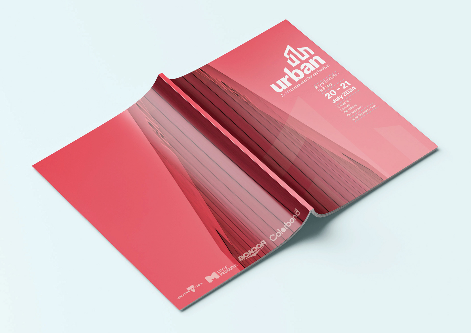
Urban requires a multi-page publication and poster for its annual architectural and design festival to bring together people within the industry, new people exploring their interests to connect and network.
Solution:
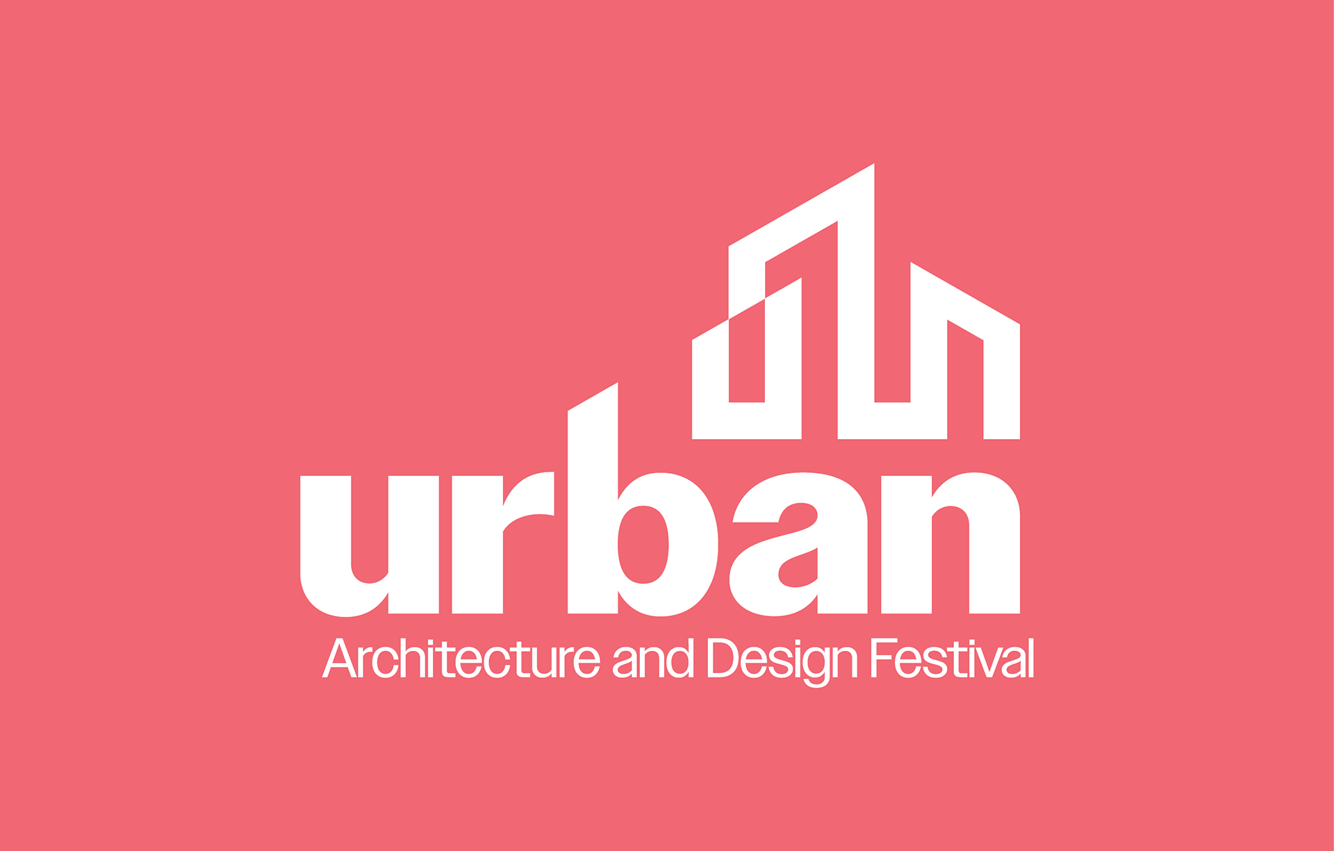
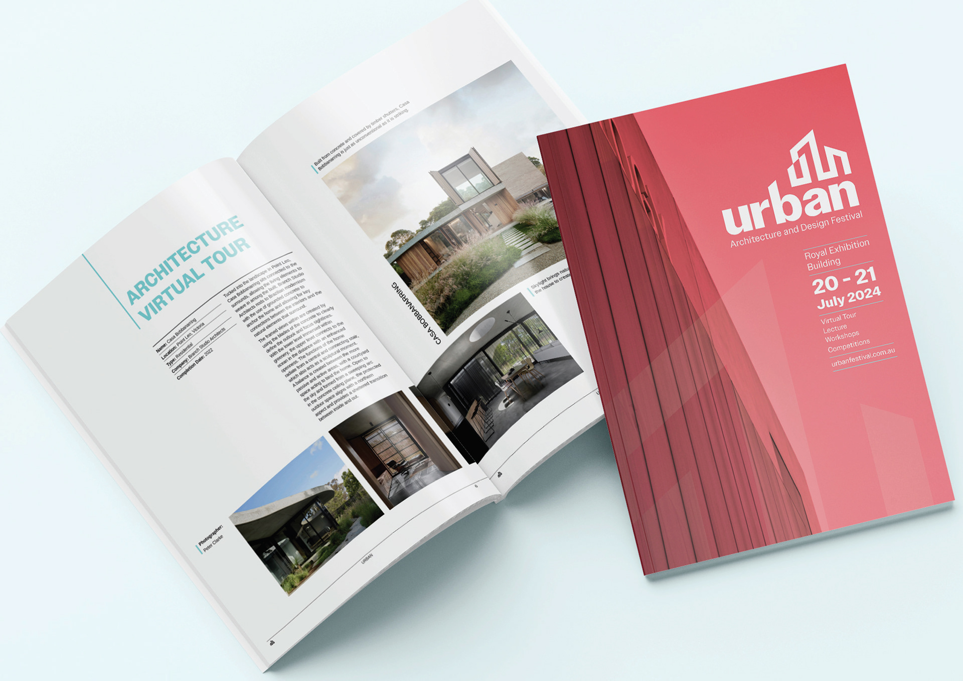
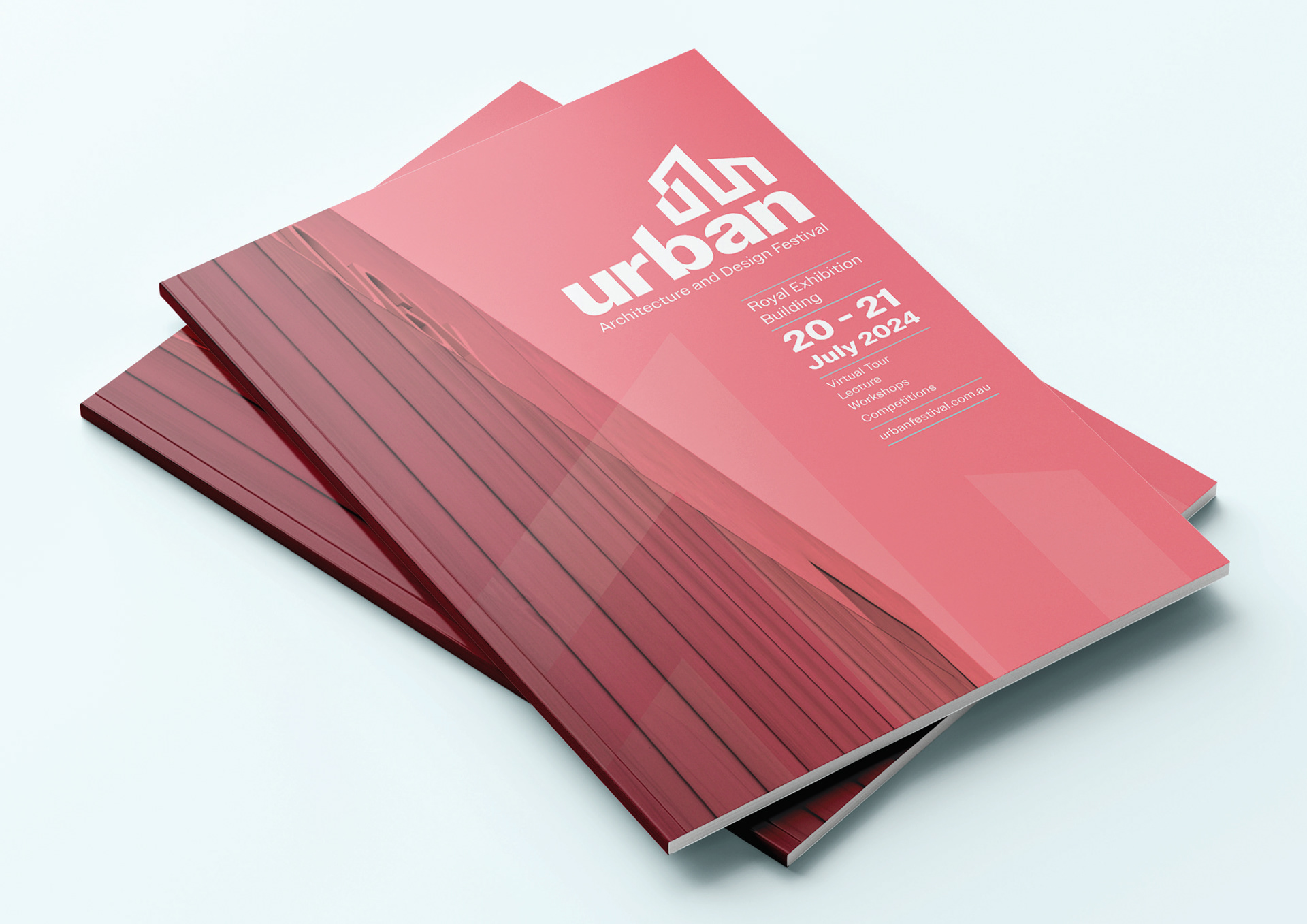
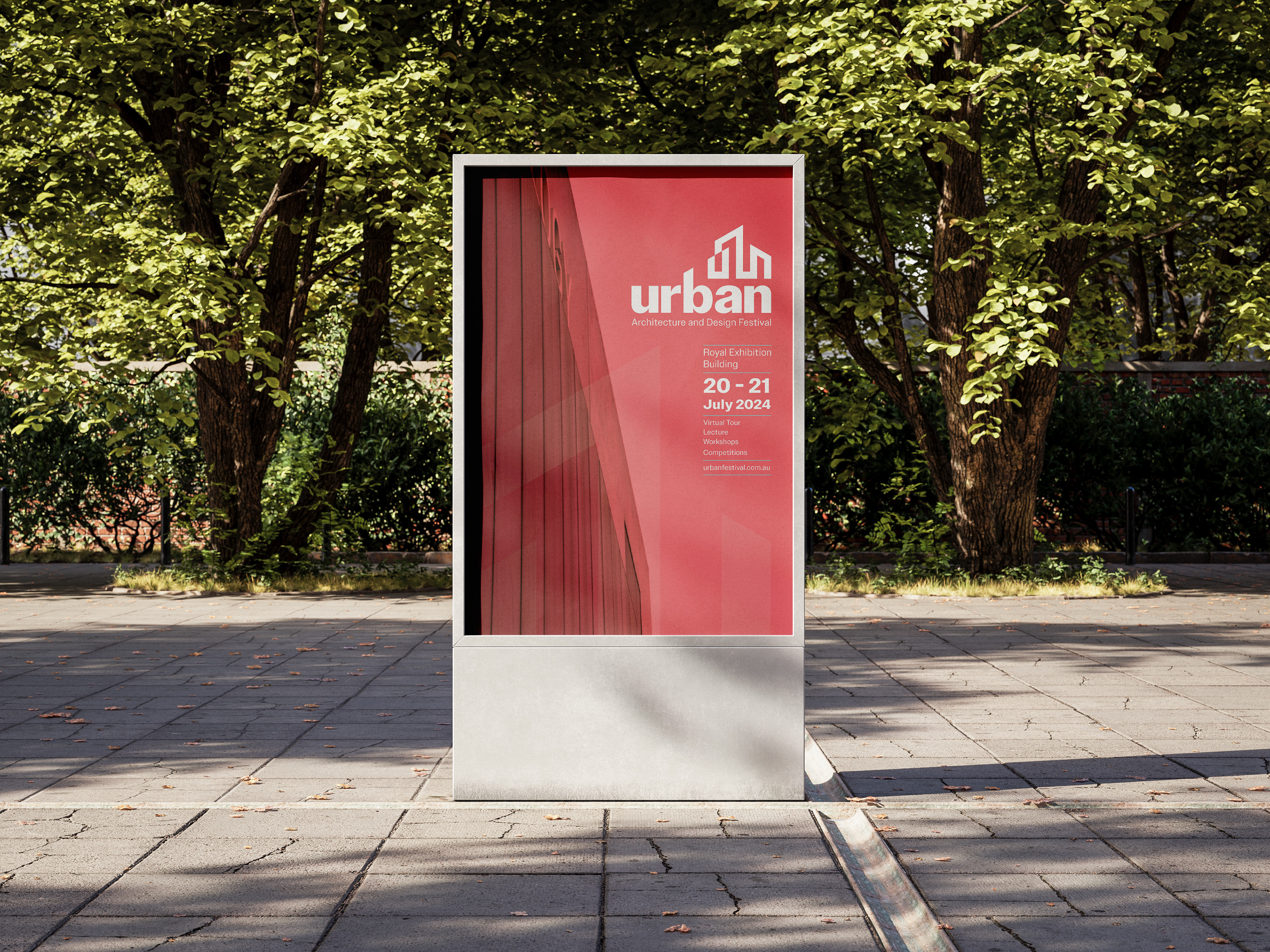
A unique brandmark was created with the figure mark resembling a building whilst spelling out the letter ‘UBN’ to represent the name Urban.
The angle of the figure mark also lines up perfectly with the letter 'b'.
The balance between the negative and clear hierarchy helps to create an effective composition.